Loro
Project & Product manager to help a startup Co. from Harvard Innovation Labs with an assistive device. Conducted website redesign and ideate solutions for mobile interface. Applied user interviews, competitive analysis and UX methods to create a mid-high fidelity website prototype to meet user needs.
Mid/High fidelity mockup in Sketch & InVision software.
This Case Study has been published on Medium: UX Planet.
The Client
A team from Harvard’s Innovation Lab created Loro, “a smart companion robot for a wheelchair user”. Loro is a startup company that is currently at Halcyon Incubator in DC and was created by students at Harvard. The team was inspired by their friend Steve who was diagnosed with Amyotrophic Lateral Sclerosis, or ALS. This degenerative neural disease weakens muscles and impacts physical function.
Design Objective
Loro is in need of a compelling, user friendly and accessible website to sell their product while educating the consumer about its many amazing features. Furthermore, Loro requested recommendations for Squarespace as they were shifting their website from Wix.
Scope & Role
Length of Project: Two Weeks
My Role: Project Manager | UX Design | UX Research
Contributions: Solo Project - UI, Web Development, Data Analyst, UXR, Usability Testing, UX Strategy
Statistics
28 Survey Responses (two rounds)
11 User Interviews (phone and in person/ two rounds)
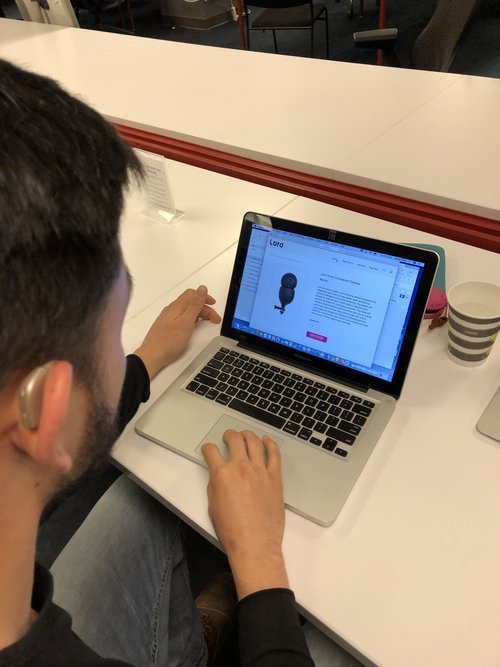
4 User Testing of current website
4 User Testing of redesigned website
2 User Personas
1 User Journey Map
Tools
Paper & Pencil
Sketch
Principle
InVision
Excel
UX Methodologies & Deliverables
Screener Survey’s
User Interviews
Affinity Mapping
Card sorting
User Testing
Task Analysis
User Personas
User Journey Map
Site Map
Secondary Research
Competitive Analysis
Low Fidelity Paper Prototype
Mid/High Fidelity Sketch Website Prototype
Usability Testing
Iterations
Problem
Future users of Loro’s website and app need to access information that is direct, simple and easy to digest so that they are able to understand the product and it’s features.
Result
Loro’s website redesign and app onboarding provides Loro’s future users with a clear, intuitive and user friendly experience.
Designing for Accessibility
A closer look into website research and development for accessibility
“Loro is a smart, caring, playful, cool, and personalized companion for wheelchair users, that can see, speak, listen and learn by artificial intelligence and machine learning. The system will be able to monitor users’ health status in real-time and provide reminders for medication and tasks. The robot will enhance physical abilities with more than one way to interact with loved ones and how they communicate with others. Loro empowers people with physical challenges with the ability to communicate, see, control, and connect with their environment. to be independent and free.” (The Loro team)
Discovery
This project was divided into 3 stages. The first phase was to develop a research plan to understand how potential users of Loro’s products learn about the products online. How do potential users with disabilities proceed with onboarding and login/registration of existing apps they use. And last, understanding direct competitors of Loro and major e-commerce website functionalities. The second phase was to compile all the research and filter it through the UX process of affinity mapping, card sorting, competitive analysis etc. And, the third phase was to deliver a user friendly and intuitive website plus app that is validated through an iterative research and development process.
Research
The research began with an online survey that focused on understanding what was the most important features people who have created e-commerce websites were interested in. Below are some of the answers received:
“Integration with third party tools is important.”
“Accessibility to people with disabilities and mobility restrictions.”
“Ease of social sharing. Save hours on marketing schedule.”
“Having the power to configure the website to your liking.”
Affinity Mapping
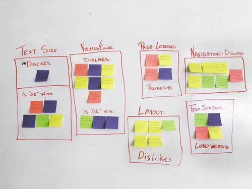
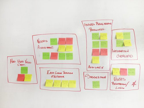
After collecting all our research from the online survey and two rounds of in-person interviews, we were ready to start affinity mapping to organize our data into trends for both website construction and onboarding for app development.
The affinity mapping image above revealed these trends for the website design:
Layout
Navigation
Text Size
Page Loading
Visuals & Color
The following affinity mapping above: These trends were then revealed for the app onboarding and login/registration process:
Issues remembering passwords.
Information overload
Login through Facebook
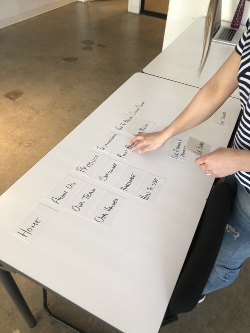
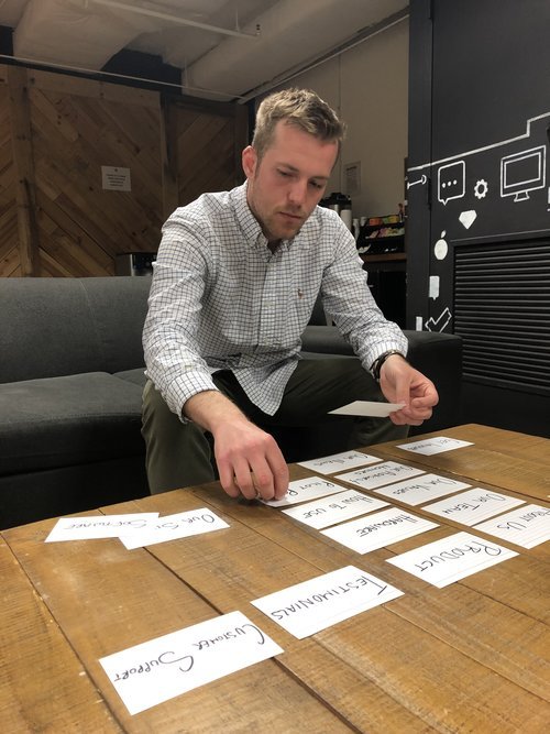
Card Sorting
To further understand user needs a card sorting process was conducting to determine the layout of the website. Several rounds of card sorting were conducted to develop the information architecture of the website.
Competitive Analysis
I then conducted two rounds of competitive analysis to clarify what content was important to prioritize for the website based on two categories as seen below:
Developing A Plan
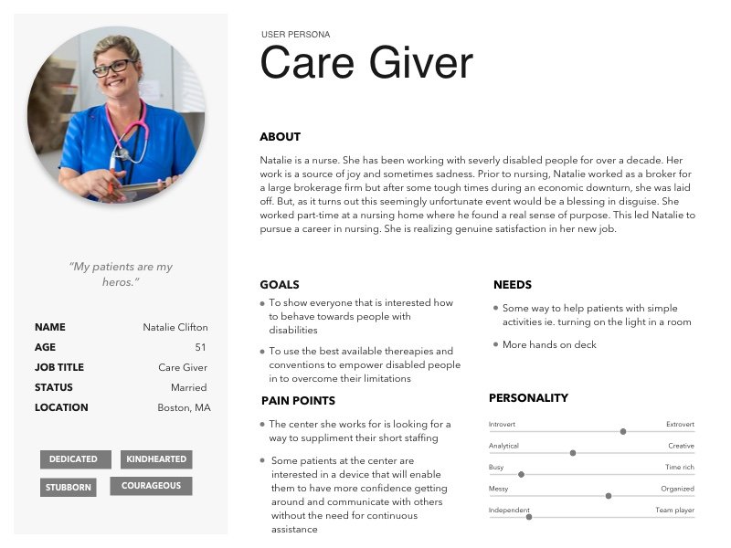
In order to sympathies with our potential users, we created two personas based off of real people we interviewed. Gathering all our research data and synthesizing our findings we developed two personas: the caregiver and the disabled potential user of Loro.
User Personas
Customer Journey Mapping
The next step was to create a customer journey map and use our “care giver” to gauge the logical and emotional process of the individual attempting to navigate within Loro’s website to learn about the product and ultimately decide if this product is right for the individual she cares for.
Paper Prototype & Usability Testing
Now we were ready to develop our paper prototype of the website and start usability testing to further validate the design. Several rounds were conducted to ensure ease of use.
Mid-High Fidelity Website Prototype
Comfortable with the usability and clarity of the paper prototype we are now ready to start creating a mid-high fidelity prototype within Sketch. To keep the design consistent across the website and app, I developed a style guide to help us along the way.
With the mid-high fidelity website prototype ready, I was not able to do several rounds of user testing and iterate on any design changes that needed to be made.
User Testing
User quotes received from 4 individuals:
“This banner image also has a link/button where you can continue learning. It’s good to have multiple avenues to learn. Especially for tech products.”
“I love the format. It’s intuitive and simple. It’s easy to digest this information. Everything is explained in sections on the main page and in small blocks of text and that works for me.”
Solution Statement
We believe that our website redesign and app onboarding provides Loro’s future users with a clear, intuitive and user friendly experience.
Next Steps
Ongoing Development — Website:
Build out a live chat feature on the website to connect with customers in real time.
Build out additional content in “About Us”
Continue user testing of website functionality and customer ease of understanding.
Ongoing Development — App:
Social Media Login
Suggested video tutorial of how to use app
Continue building out additional accessibility features.
Enhancement Consideration
Next gen mobile app experience to consider enabling the user to have in-app communication with personal caregiver team to add value and built in care for scheduling appointments via e-mail and phone calls. In app shopping experience to highlight latest upgrades personalized to the users needs (pre-calculated to include price after insurance coverage).


