D.C. Gov 311
Redesigned D.C. Governments 311 website customer portal and implemented information architecture methods. Applied user research, competitive analysis, affinity mapping, card sorting, created an interactive mid-high fidelity website prototype for user testing and iterated for design specifications.
Mid/High fidelity prototype created in Axure RP software. Utilized Photoshop for image editing.

This Case Study has been published on Medium: UX Planet.
The Client
Managed by DC Government, the District of Columbia’s 311 is a toll-free number and web service platform that allows the public to report and track non-emergency service requests with city services and information. The Office of Unified Communications (OUC) oversees the designated call center and web platform for all 311 calls are requests.
Design Objective
Create “a portal that elevates real-time support, highlights important alerts and spotlights city services statuses intuitively, the city would like to communicate more effectively with 311 customers. Billed as a live customer service platform, the site should quickly get information from customers and provide a constant flow of real time communication regarding resident needs. As a result, live status reports and personalized followup serve to exemplify the excellent service experiences each resident should come to expect with working with District government teams.”
Scope & Role
Length of Project: Two and a Half Weeks in a 3 person team
My Role: Lead User Research
Contributions: User Interviews, User testing. Contributed equally to all aspects of the project
Statistics
76 Survey Responses
16 User Interviews (phone and in person/ two rounds)
5 User Testing of current 311 website
7 User Testing of redesigned 311 website
Tools
Paper & Pencil
Axure RP
InVision
Photoshop
Excel
UX Methodologies & Deliverables
Screener Survey
User Interviews
User Research
Affinity Mapping
Card Sorting
Secondary Research
Competitive Analysis
Wireframes
User Flow
SWOT Analysis
Paper Prototype
User Testing
Task Analysis
Mid - High Fidelity Website Prototype
Revamping community engagement with D.C. 311

With 700,000 + residents in Washington DC and over 14,700,00 + people living in DC, Maryland and Virginia combined, the DC311 call center is likely to be inundated as the population of people who live, work and play in the city grows. Creating an online platform that allows people to resolve non-emergency complaints and gain access to services’ that are available to them is key. Citizen engagement platforms like DC’s 311 service is essential for linking DC government to it’s residents. It is of importance that DC governments 311 system be transparent and performance oriented to insure ease of use for it’s citizens.

Discovery
Outlining The Design Process
The project was divided into 4 stages. The first phase was to discover user pain points with DC311 through a screener survey that would target DC residents and frequent visitors that have used 311 services in DC or other cities. The research and work throughout the discovery phase lead to understanding the core problem and helped to develop a solution that we believe fit the needs of DC311’s users during our ideation phase. And finally, the design phase began and an iterative process during the design and development was conducted with several usability tests.

The screener survey was distributed online through various social platforms. We were able to reach 76 people. 26% of the people we interviewed have never heard of 311 and it’s services. Again, 26% of our interviewees had used DC311 services and a total of 65% of people who used 311 services did so via phone calls.

We reached a diverse demographic of interviewees ranging in age and socioeconomic status. The results from our screener survey then helped us filter our users to 16 individuals who we preformed in-depth interviews with. We developed a second round of questions that was more focused on their more recent experiences using 311 services. What was the submission process for issuing a service request like, how did they track their service request and what was the outcome or end result.
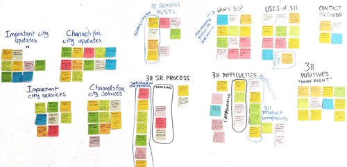
Affinity Mapping
“I had difficulty in reporting things with no clear category.”
”Finding the service was ok but it looked outdated. There was a lot of extraneous pathways, I remember having to connect to many paths to get to the solution.”
We started with affinity mapping our survey results to help us organize the data into clear groups/themes. What we learned from this process was that some people are typically satisfied with 311’s responsiveness. They found that the process was simple and straightforward. However, we also discovered difficulties with people’s ability to use the current 311’s website.
User Testing of Existing 311 Web Platform
This brought us to further researching the current DC311 website to understand user frustrations in more depth. Our user experience observations were conducted with 5 individuals.
The user testing of the current DC311 website revealed many problems:
Difficulty navigating the website
Difficulty finding a specific service request due to a lack of categories
No search field or an inability to locate one
Inability to understand and use the service request map
In addition to our UX observation of the current DC311 website, we also conducted a competitive analysis of DC’s 311 website with that of 9 other major cities in the United States. Some major gaps were discovered through this process.

Everything highlighted in yellow in the above chart displays the elements DC’s 311 website is missing that the majority of other cities have.
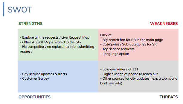
In the next step of our discovery phase, we conducted a SWOT Analysis to help us further clarify what is of importance when moving on to the design phase.
Solution & Design Process
Now that we have collected all our data from interviews, competitive analysis, user testing of the current DC311 website and SWOT analysis, we are finally ready to develop our solution with a more concrete understanding of what the problem is.

We were now ready to design with these goals in mind. Our solution for optimizing the functionality of the website is to directly cater to the needs and wants of users.
Users want a clear and straightforward service submission process.
They also want a simple and easy way to check their service request status.
Providing the user with a live map of the city allows them to further increase their ability to view their service request status while being able to see all the requests in the city.
Adding “City Updates & Alerts” allow the user to gain additional pertinent information on things of interest othem such as transportation delays, school closings, latest tweets from municipalities etc.

Information Architecture

Our team mapped out the user flow of our redesigned website to further gauge ease of use. Although we implemented an additional step in our process, it was a necessary step in simplifying the process overall. “Select category” within our user flow process simplified the process by providing clear categories for users to understand and select from rather than having to endlessly scroll through the list of services until your need is found (as it currently functions in the DC311 website).
Sketching: Wireframes & Wireflows

As my team and I began the visual design process of the project, we each sketched out how our updated DC311 website would look and cross compared our designs to select and combine the best options. We then developed a paper prototype from our wireframe sketches.
Low-Fidelity Paper Prototype Testing
Key Insights & Takeaways

The user testing allows us to iterate on our design to address issues. Our designs moving forward met the suggestions provided to us from our users.

Now that we are ready with our functional redesign of DC311’s website and service request process, we continued our testing with seven users.

Takeaways
The end result of our website mid/high fidelity prototype was received positively by our users. They found the website to be “clean” and were happy with the layout design. Navigation was quick, intuitive and easy.
Recommendations
User satisfaction and feedback with website redesign
Additional data gathering to optimize user flow
Live chat functionality and user necessity
Building out additional features for user engagement
Building out “language” for inclusivity and accessibility
Developing a mobile-friendly platform of the website
Continue building out content
Continue ongoing user research and testing
Final Thoughts
Our approach to the usability of DC’s 311 web platform was to place users at the center of the process. My team and I designed and developed with the user in mind. Our holistic approach to enhancing usability directly connects the government to citizens needs while fulfilling their expectations for a functional online platform that’s easy to use and visually enjoyable. We believe our product did more than just mitigate the current DC311’s website shortcomings. We believe our produce creates a more desirable engagement system for DC residents that are specific to the unique needs of the community.